Types of CHART

Dealing with large amounts of market or business data can be overwhelming, particularly when sifting through numerous figures in trade books or spreadsheets. This is where data visualization comes in.

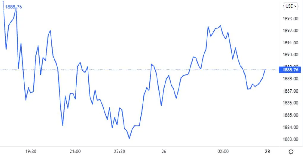
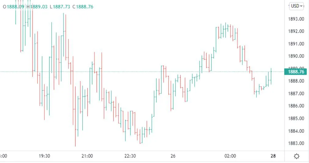
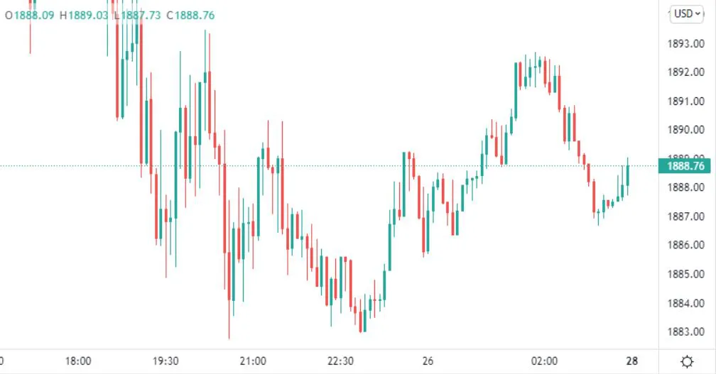
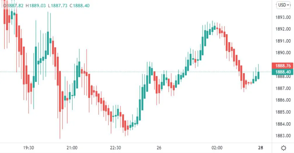
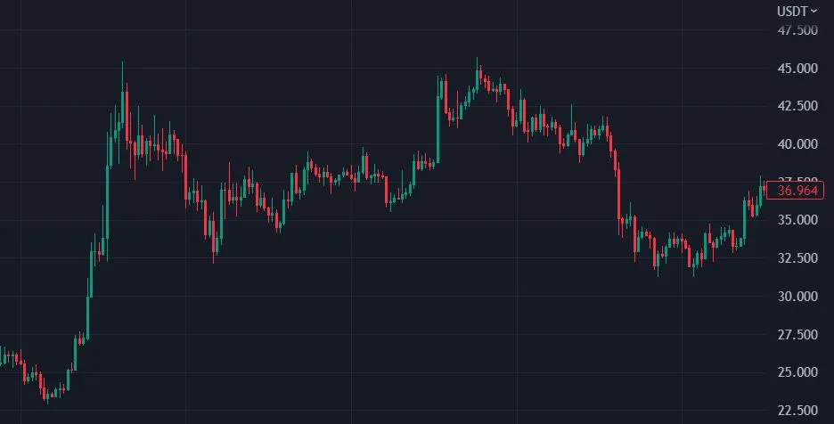
In the stock market, data visualization is crucial for making informed decisions. Time series charts, such as line charts, candlestick charts, and bar charts, are commonly used for technical analysis.

These charts illustrate stock price changes over time, enabling traders to make informed decisions based on their individual preferences and strategies.

By using data visualization, traders can quickly and easily make sense of complex data and react to changes in the market. So next time you're faced with a pile of numbers, remember the power of data visualization.

Below are few commonly used charts:
  1. Line Chart

    A line chart is a simple type of chart that shows the closing prices of something over time. The closing prices are connected with a line to create a continuous graph that is easy to understand.

    Advantages

    • Simple and easy to understand
    • Can manage emotions by using one color for the line
    • Good for long-term analysis
    • Great for beginners to start with

    Disadvantages

    • Lacks details compared to other charts
    • Only shows the closing price
    • Not suitable for price action trading
    • Not suitable for short-term analysis
  2. Bar Charts

    A bar chart is a graph that uses bars to represent data. Each bar represents a category or group for specific time-frame, and the length of the bar represents the value of the data for that category. In financial markets, a bar chart can also show the opening, high, low, and closing prices of an asset for a specific time period. These four prices are called OHLC (Open, High, Low, and Close) and are displayed on the bar.

    Advantages

    • Bar charts provide more information about the market compared to line charts.
    • They use different colors to display bullish and bearish bars.
    • Bar charts allow you to study the relationship between the highs, lows, opens, and closes of different bars.
    • They are helpful for technical analysis and price action.

    Disadvantages

    • Bar charts can be more difficult to analyze compared to candlestick charts.
    • Since each bar looks like a single stick, it can be hard to interpret the data.
    • Bar charts are not suitable for beginners who are new to analyzing financial data.
    • The chart can be noisy or messy, making it harder to read.
    • Looking at bar charts can sometimes lead to emotional trading decisions.
  3. Candlestick Chart

    Candlestick charts are a popular way to analyze financial data. They are similar to bar charts, but each candlestick includes more information. The body of a candlestick represents the opening, high, low, and closing prices(OHLC) for a specific time period.

    Candlestick charts make it easy to spot gaps between the bodies of the candlesticks, and each candlestick is separate and does not overlap with the previous one. They provide a clear visual representation of the price action and can help traders identify trends and potential changes in the market.

    This complete trading guide app uses Candlestick Charts for technical analysis and price action.

    Advantages

    • Candlestick charts include all the information from bar charts
    • Candlestick charts are easier for traders to understand and visually analyze market trends.
    • Most technical indicators are designed to be used with candlestick charts.
    • All price action patterns, candlestick patterns, chart patterns, and more can be easily identified on candlestick charts.
    • Candlestick charts are preferred by many types of traders.

    Disadvantages

    • Candlestick charts can be noisy, messy, or distracting, making it harder to read the data.
    • Looking at candlestick charts can sometimes lead to emotional trading decisions.
  4. Heiken Ashi charts

    Heiken Ashi charts are similar to candlestick charts, but they filter out market noise to provide a clearer view of price trends. Heiken Ashi candlesticks show OHLC prices just like candlesticks, but they calculate the open and close prices using a different formula.

    The formula for calculating the open price is the average of the previous candle's open and close prices. The formula for calculating the close price is the average of the open, high, low, and close prices of the current candle. This method smooths out the price data and can help traders identify trends more easily.

    Open Price = [(Open price of previous candle) + (Close price of previous candle)] / 2

    Close Price = (Open + High + Low + Close) / 4

    Advantages

    • Heiken Ashi charts are useful for trend trading and can help traders identify trends more easily.
    • They make for excellent indicators as they filter out market noise, providing a clearer view of the market.
    • The charts have a clear and visually appealing layout.
    • Trends are easy to observe on Heiken Ashi charts.
    • They make it easier to identify support and resistance levels in the market.

    Disadvantages

    • As Heiken Ashi charts have a very smoothing effect on price data, which can result in lagged trading signals.
    • Some price action patterns, such as dojis and hammers, may not be visible on Heiken Ashi charts.
    • Fewer traders use Heiken Ashi charts compared to other chart types.
    • Heiken Ashi charts may not be suitable for trading in consolidation markets, where price movements are flat and without clear trends.


Share the App - Share Alpha